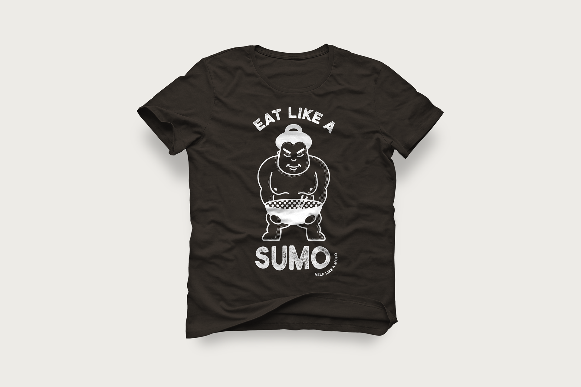
CONCEPT 1:
Inspired by Japanese design, dotted patterns are mixed to show texture and shading in a one-color application. The wrestler carries a heavy load, showing the strength of the community and how they can relieve some of the challenges by continuing to support local restaurants.
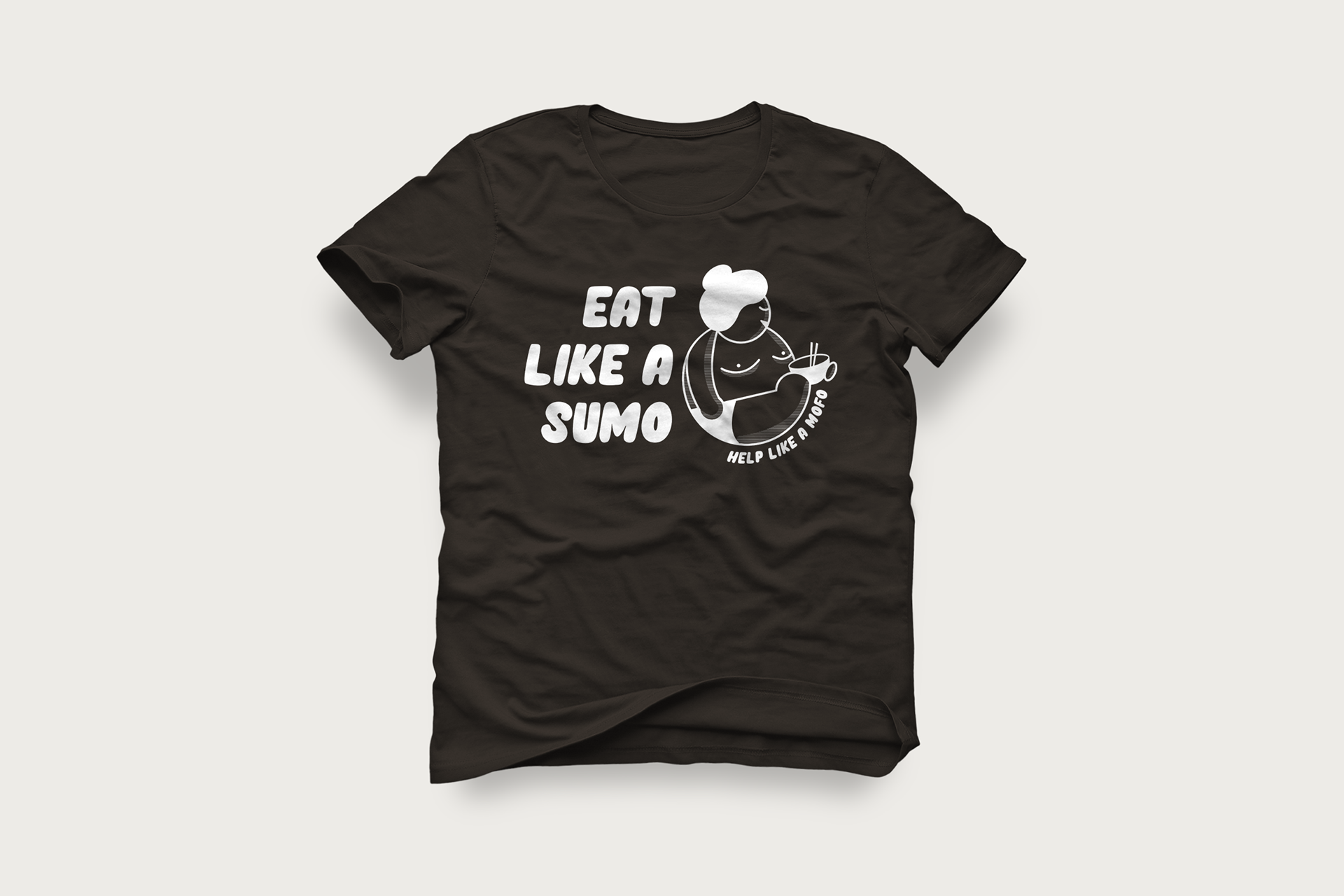
CONCEPT 2:
This concept is a little more light-hearted, inspired by the cute and bubbly “kawaii” culture of Japan - without veering too far into “Hello Kitty” territory. The roundness of this wrestler makes him seem more friendly, paired with a font that seems like a fun cartoon, therefore a fun thing to be part of.